
Virgin America aircraft. Chris Parypa Photography.
Virgin America’s new website is unlike any other airline website in that it focuses nearly every pixel on helping the customer book a flight. The homepage is clean, contemporary and contains no unnecessary information or distractions (goodbye credit card deals!). It’s a joy to use and the goal is clear: ‘Let me help you book a flight’.
The airline also goes to great lengths to inject personality and fun back into their website and brand. While Virgin Australia has long departed from the funky, youthful Virgin vibe it started out with, Virgin America has embraced it once again, introducing quirky avatars (although I’m not sure how useful they’ll be), humour and “mood-lit” inspired colours.
“Our new website, like our plane cabins and most other aspects of the Virgin America experience, was created by listening to what travellers liked and didn’t like” says Luanne Calvert, CMO of Virgin America. “The goal of the redesign was to better reflect their needs and how people book and manage travel today.”
Virgin America has set themselves apart from their local competitors (and international partners), and will likely dictate what we see from other airlines in the next 12 months. Let’s look at the top 5 things VX is doing right with their new website:
1) The website focuses on making a booking as simple as possible
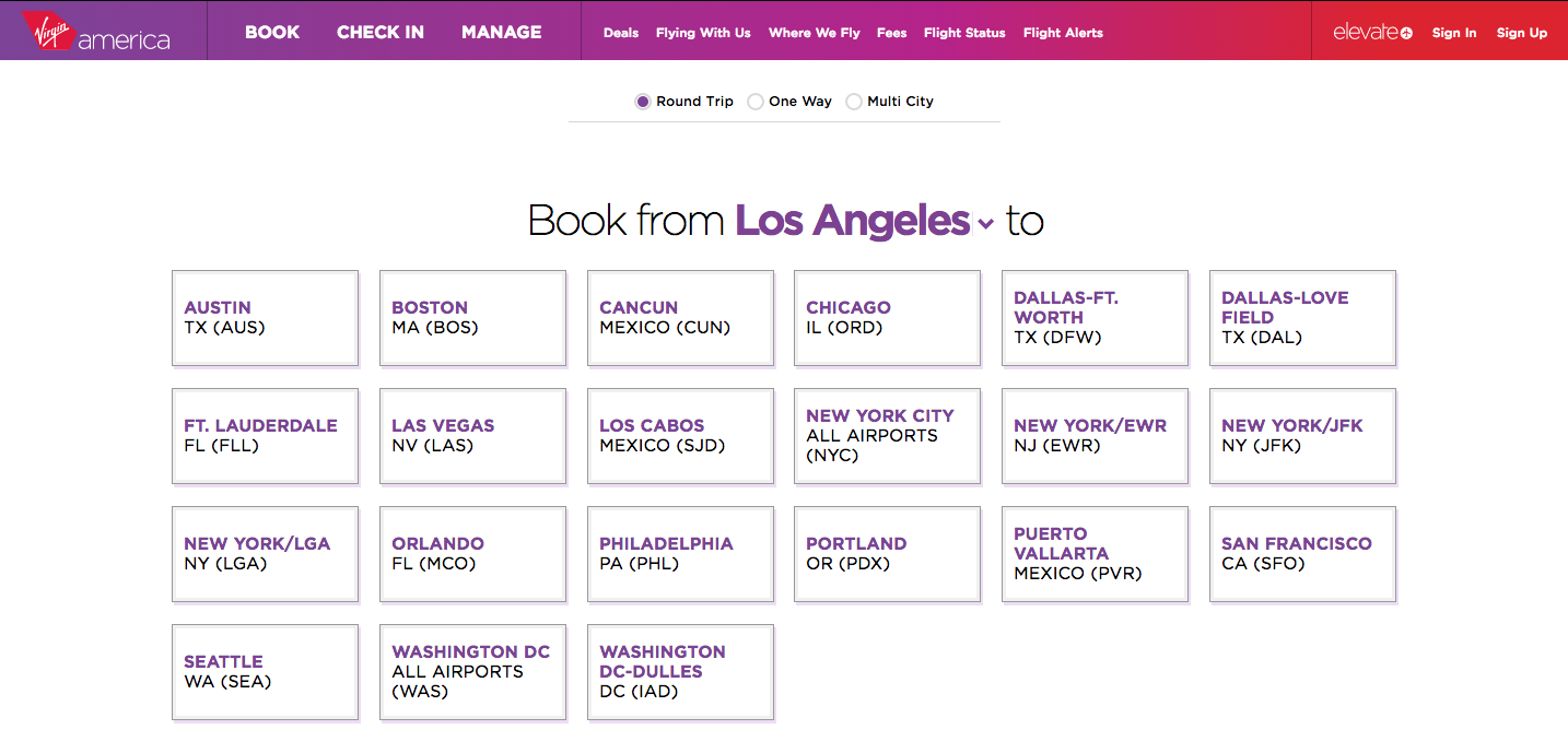
Homepage of the recently redesigned Virgin America website
It’s clear the mandate given by Virgin America and its customers to design studio Work & Co. was to forget everything we know about booking flights online and build how we should be booking flights in 2014.
Multiple pages have been replaced with a single page or ‘screen’ that changes depending on what you do. Select your origin and a list of destinations are displayed automatically. Select the destination and you are then immediately presented with dates to depart and return.
Booking a flight is a relatively linear process and Virgin uses to this to their advantage by guiding the customer through the process, each action leading to the next. A customer doesn’t need to click a button to move to the next page, Virgin moves them forward in the process automatically. I found it extremely straight forward to use and was able to do a test booking in under 60 seconds (with my Elevate details already entered).
“The user experience on most airline websites today is still based mostly on decades-old design patterns and technologies” says Felipe Memoria, Partner of Product Design at Work & Co. “We decided to bring together a team of experts in both design and engineering to reinvent the entire category from the ground up.”
2) The website puts mobile on the same playing field as desktop
Virgin America website as viewed on a mobile phone
Airlines have been slow to adopt responsive web design, with Thomas Cook Airlines about the only airline until now to offer a single website that works seamlessly across desktop, tablet and smartphone.
Thankfully the new Virgin America website is designed with mobiles in mind just as much as desktop PCs. Resize your web browser window when on the site to see.
It’s critical other airlines take the same route given the rise of bookings and travel research happening from mobile devices. It’s only as a last resort I’ll use my mobile phone to book a flight. The process is usually too finicky or involved for the small screen, but this is only because the website experience wasn’t designed for mobile customers. On the other hand the Virgin America website makes it as simple as if you were doing it from your laptop.
3) The website personalises the experience throughout
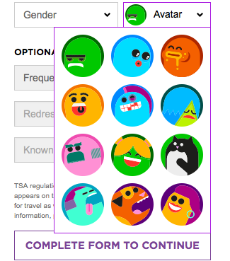
Virgin America’s monster avatars
It’s the small things that customers remember and all Virgin brands know that customer experience has to be memorable. Throughout the booking process there’s little touches you won’t find elsewhere. ![]() Book a flight to Chicago and there’s a brief reference to deep dish pizza. The top strip which keeps you up-to-date with the details of your flight refers to you by name when it’s time to select a seat. Enter your surname and there’s a remark about how ‘nice it is’. It’s also where Virgin America has introduced avatars, in this case monsters, to use to represent you and your fellow travellers on the seat plan. However, I think a better scenario would be allowing you to assign a real photograph in your profile.
Book a flight to Chicago and there’s a brief reference to deep dish pizza. The top strip which keeps you up-to-date with the details of your flight refers to you by name when it’s time to select a seat. Enter your surname and there’s a remark about how ‘nice it is’. It’s also where Virgin America has introduced avatars, in this case monsters, to use to represent you and your fellow travellers on the seat plan. However, I think a better scenario would be allowing you to assign a real photograph in your profile.
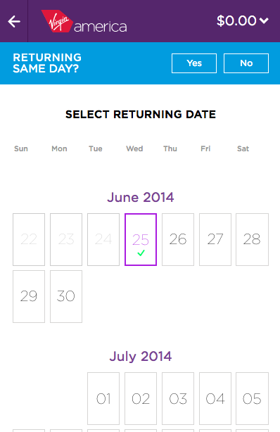
4) The website removes the ‘unexpected’ from the booking process
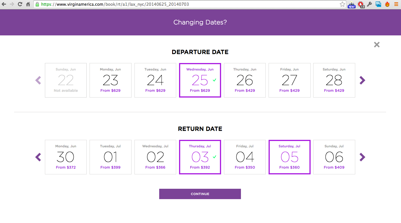
The Virgin America date select screen takes up all screen real estate
By guiding a customer through the booking process, the uncertainty that sometimes comes with booking a flight is removed. Virgin America takes the responsibility of moving a customer forward in the funnel, presenting relevant options at the appropriate times. When it’s time to select a date to depart, the on-screen focus is only on selecting a date. When it’s time to select a seat, the website’s only focus is on selecting a seat. And when it’s time to pay, that’s the only thing you’ll see on the screen.
5) Frequent flyers are well catered for

Virgin America example of a Elevate Gold customer
While the Elevate flyer program is barely mentioned on the homepage, once you are logged in it becomes the centre of attention. Upcoming flights, status levels and reward points are all neatly displayed and easily accessible. Want to check-in for a flight? If you’re already logged in and click check-in it automatically searches for upcoming flights. Likewise when you click manage. No need to mess around. It also means booking a flight is a breeze for those of you doing it regularly. It may not seem like a big deal, but as many can attest, integration with frequent flyer programs is often done poorly.
But as with any new website launch, there’s always room for improvement. For one, it’s near impossible to edit a booking once you are at the payment stage (which might be deliberate, but nevertheless annoying). Hotel and car rental booking isn’t integrated yet either (a complex task when you consider how difficult it may be to replicate the simple booking flow of the website with that of traditional hotel booking engines). And the monsters, those colourful monsters, will surely feel dated in 3 months.
It’s been 30 years since Virgin Atlantic began flying and while Virgin America may be much younger, it continues to shake up the market, first on the tarmac and now online.
Information:
Visit: Play around with the Virgin America website here.
Design Studio: Work & Co. NYC
Project Timeframe: 8 Months
Additional Reading: WIRED